
Case Details
Clients: Advisor Consultant
Start Day: 18/05/2025
Tags: Marketing, Business
Project Duration: 3 Month
Client Website:
My Role
Lead UX Designer
Responsibilities included:
UX layout and interaction design
Visual design and content hierarchy
Conversion-focused call-to-action design
Responsive layout planning
Tools used: Figma / Adobe XD
Project Overview
The Advisor Consultancy Website was designed to help financial and business advisory firms present their services, build trust with potential clients, and generate consultation inquiries.
The goal of the project was to create a professional, conversion-focused website that clearly communicates services such as financial advisory, business consulting, and investment planning.
The design emphasizes credibility, clarity, and lead generation.
Problem Statement
The previous website lacked a clear structure and did not effectively communicate the firm’s services and expertise.
Key issues included:
- Poor content hierarchy that made services difficult to understand
- Lack of strong calls-to-action for lead generation
- Limited trust-building elements such as client statistics and expertise highlights
- Inconsistent layout and visual structure across sections
- Difficulty guiding users toward consultation or contact
These problems reduced user engagement and consultation inquiries.
Design Goals
Create a professional design that reflects expertise in financial advisory and consulting services.
Clearly present services such as:
- Financial advisory
- Business consulting
- Investment planning
- Travel & aviation consulting
Encourage users to contact the consultancy through strategically placed CTA buttons.
Use visual hierarchy to guide users through the website.
Design Solutions
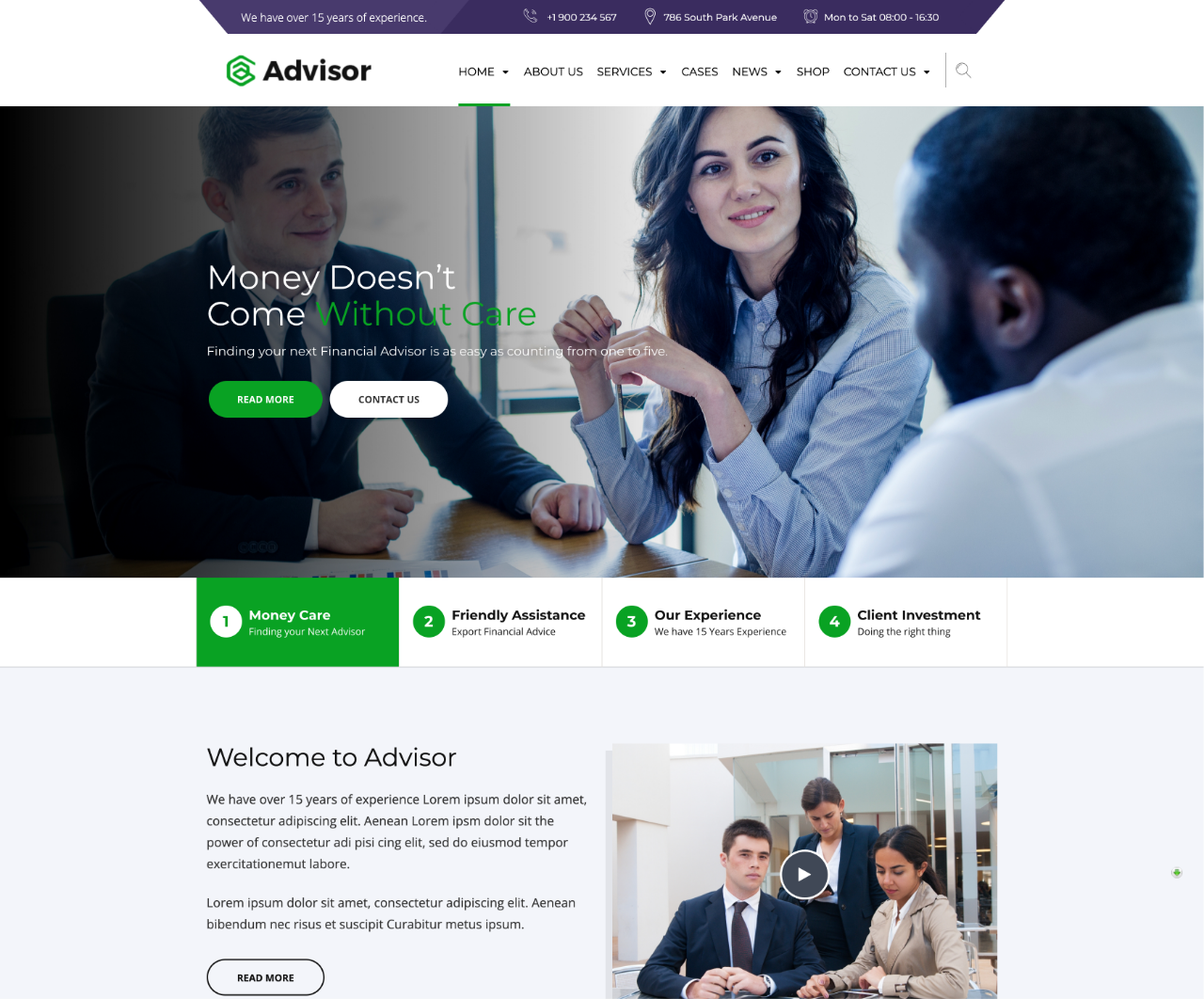
The hero section introduces the company value proposition:
“Money Doesn’t Come Without Care”
Key UX elements include:
- Clear headline explaining the business value
- Supporting description for credibility
- Prominent CTAs:
- Read More
- Contact Us
This section quickly communicates the firm’s purpose and invites users to explore further.
| Area | Before | After |
|---|---|---|
| Content hierarchy | Unclear service structure | Organized sections with clear hierarchy |
| Lead generation | Limited CTAs | Multiple strategic contact points |
| Trust elements | Few credibility indicators | Statistics, experience, testimonials |
| Service visibility | Hard to understand offerings | Service cards with icons and images |
| User flow | No clear journey | Structured flow: Intro → Services → Trust → Contact |
Outcomes
The redesigned website achieved several improvements:
- Clearer communication of services
- Stronger brand credibility
- Better lead-generation opportunities
- Improved user engagement through structured content
The website now acts as a digital marketing tool that supports business growth and client acquisition.
The Results
The Advisor Consultancy website redesign focuses on clarity, credibility, and conversion.
By combining structured content, visual hierarchy, and strategic call-to-action placement, the platform effectively guides users from initial interest to consultation request.
The result is a professional digital presence that strengthens trust and supports business development.
100% SOX compliance in Settlement process automation
Customer reviews of the case
The structured layout and service sections make it much easier for potential clients to explore our consulting services.